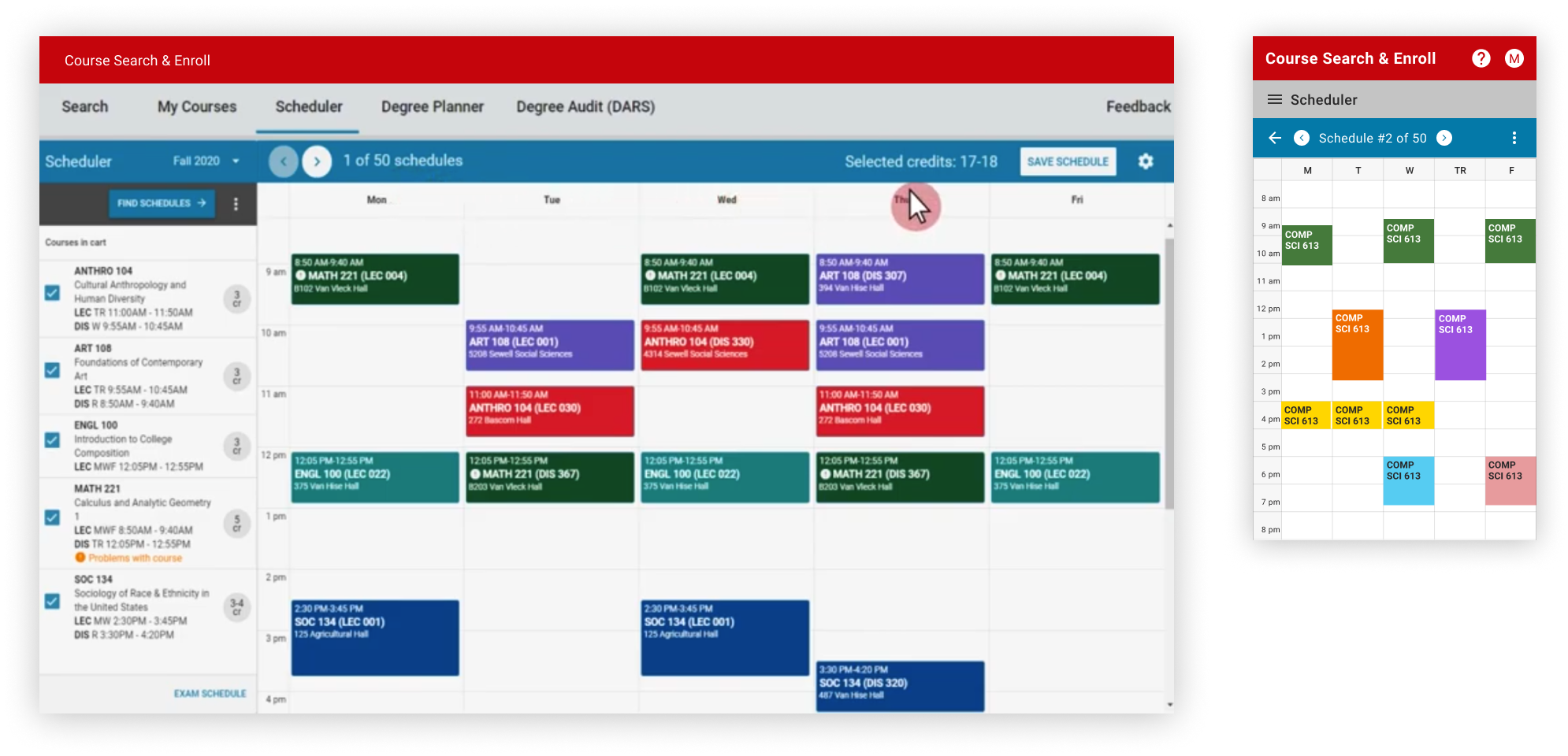
Course Search & Enroll (CS&E) is a web-based application where UW-Madison students look for course details and register for future classes. Scheduler is a course planning tool within the CS&E app that assists students to visualize the potential schedules of selected courses, it aims to help students better decide which course and sections work best for them.
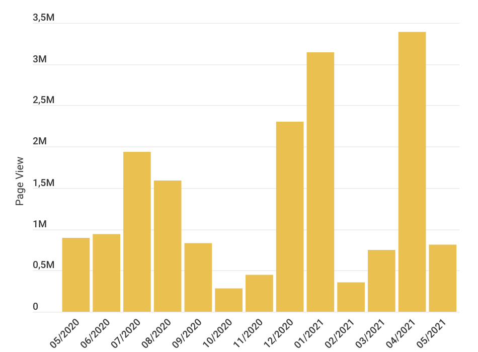
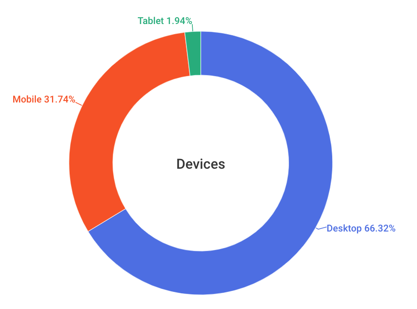
Since initial launched in 2017, CS&E is a very busy website that has been using by every UW-Madison student. According to Google Analytics, the site's user traffic can even reach up to 3.3 million sessions during the enrollment month. However, as one of the five sub-pages, Scheduler's pageview accounts for a low rate, while the bounce rate is quite high.
Although UW-Madison encourages students to use the Scheduler for their course planning, it's obviously not utilized as it was expected to be. So, Registar Office collaborated with Center for UX to find out why students didn't use the Scheduler and resolve existing usability issues.
How might we improve the course planning experience to help students make enrollment decisions?
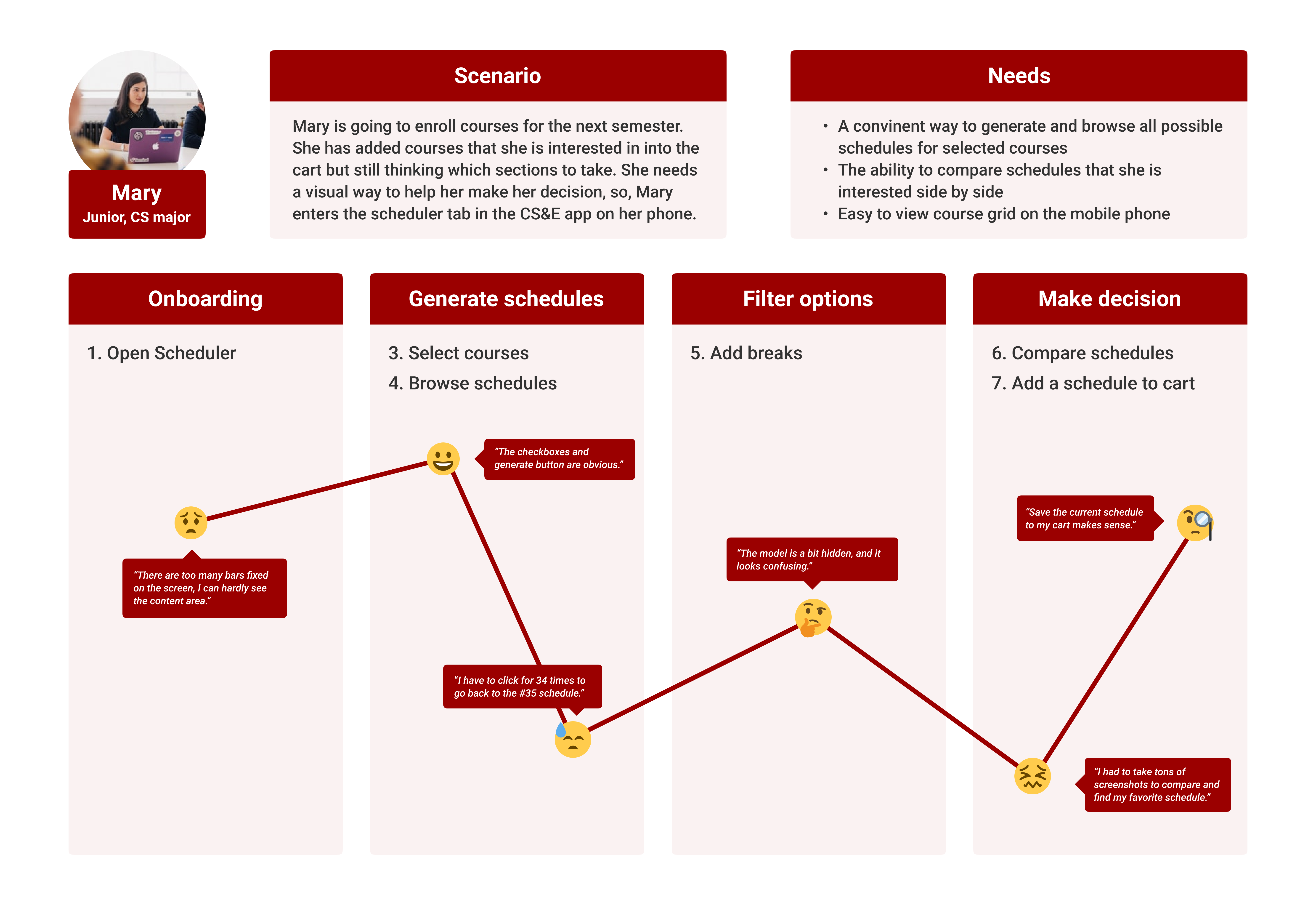
1️⃣ Users want to view the entire grid without scrolling
Fixed bars take up too much space on the screen.
2️⃣ It's hard to navigate to a specific schedule
Users can only click the "next" button until finding the wanted one.
3️⃣ Users would like the ability to compare schedules
They often use phones to take pictures or screenshots.
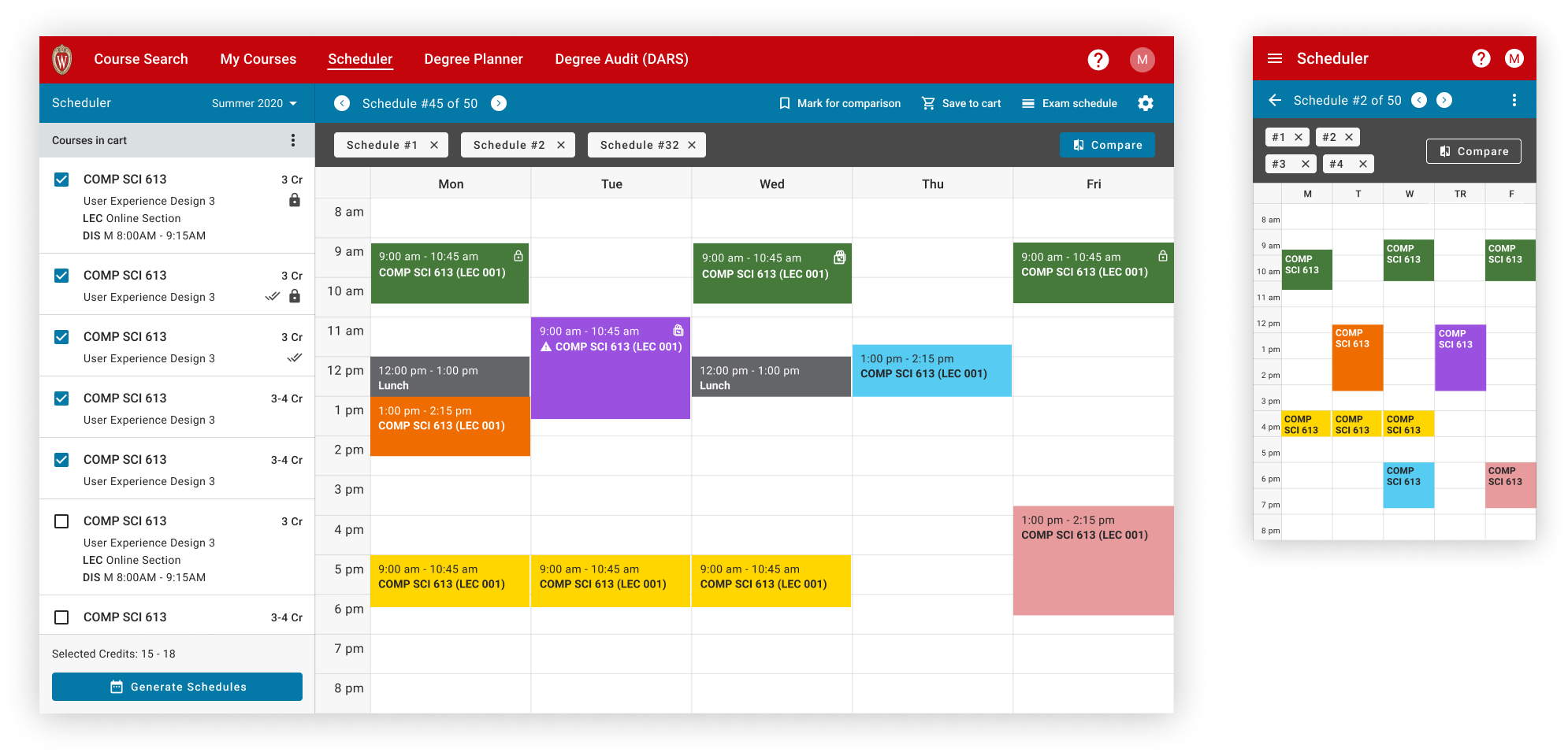
To leave more space to display useful information, we reduced the number of fix bars and narrowed down the grid size to fit the screen.
As suggested by many students, we added a feature for comparing multiple schedules side by side at the same time.
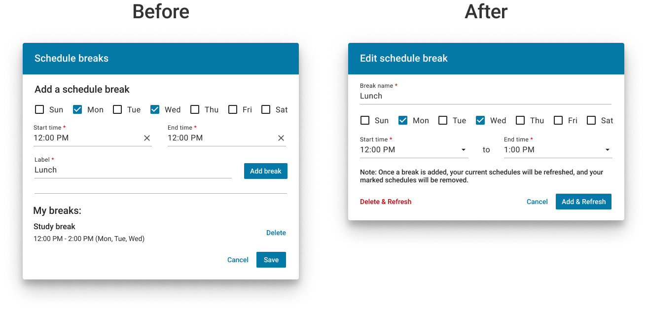
1. Still can't go to a specific schedule directly.
2. The chip's focus area is too small to be accidentally clicked, especially on mobile.
3. When there are a lot of marked schedules, the grey bar would be very large.
We came up with a "list view" option which shows all schedules at the same time so that users can easily go to any schedule, or mark/unmark any one for comparison.
After getting rid of the grey bar, the grid area becomes larger. At the same time, users wouldn't need to worry about accidentally trigger any unwanted actions.
In addition, we also updated designs of many other small pieces such as making the add break modal more intuitive, optimizing the function placement, fixing accessibility and consistency issues, making messaging and instruction language clearer, etc.
After doing several rounds of user testing and conducted QA tests, the new Scheduler was launched on May 18, 2021. We announced the new updates and received a lot of positive feedback from students. It was also a great pleasure to see the significant improvements of related analytics metrics!