Without the Internet, the in-flight entertainment (IFE) system embedded in the seatback is almost the only way for passengers to spend time on the flight. Personally, I enjoy the customer services that American Airlines provides, but I don’t think their IFE’s interface is as good as it could be. So, I redesigned it during the latest trip I took from Chicago to Shanghai.
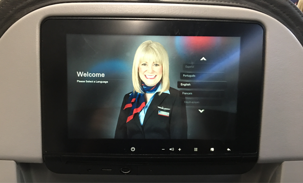
The first screen passengers will see is a smiling staff asking you to select the system’s language. Although this is an important step before using the IFE, I believe the onboarding screen has a great potential to better help passengers start their journey in the cloud.
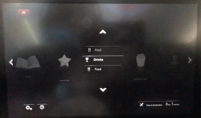
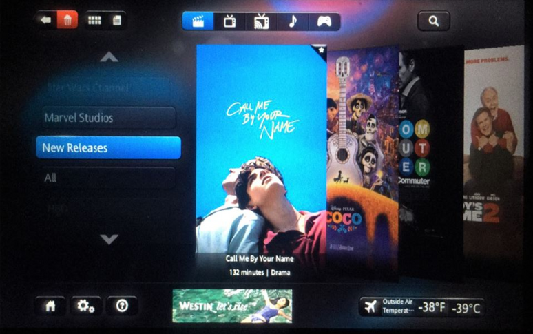
To select an option, users need to scroll the list until that one is moved to the center of the screen, and then they have to click it to select. If there are multiple sub-options, users have to do the same action again.
To select an option, users need to scroll the list until that one is moved to the center of the screen, and then they have to click it to select. If there are multiple sub-options, users have to do the same action again.
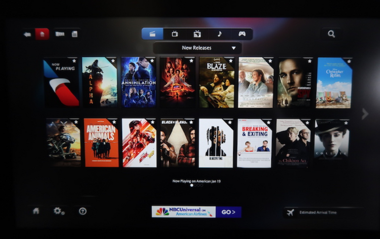
Users can view the item list in the grid view or in the gallery view, but either way is accessible enough. In the grid view, there isn’t any titles or assisting texts but only tiny images. It's hardly for users to know what a movie is without clicking into it. In the gallery view, although it displays the movie title and playtime, the scrolling gesture adds a big challenge for users to browse items.
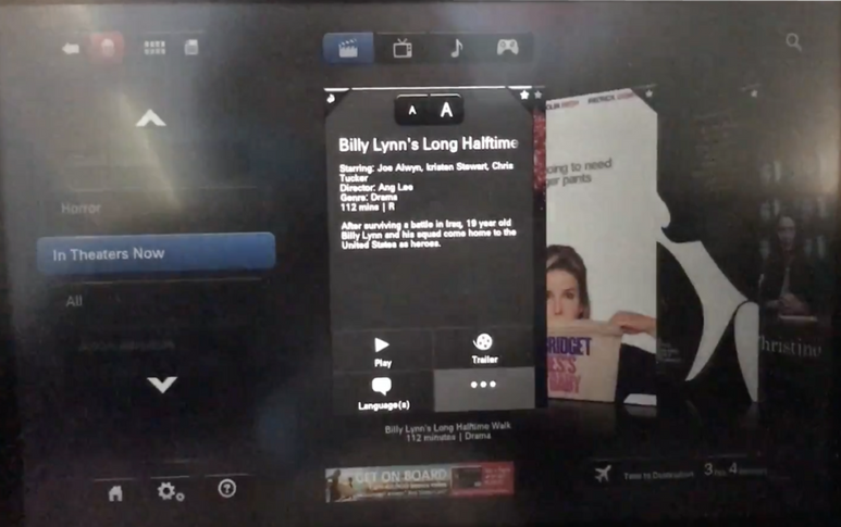
A pop-up box will appear once a movie option is clicked. The box is tiny and the texts inside is very difficult to read. In addition, considering some AA’s passengers might have comprehension challenges (i.e. non-English native), some labels (i.e. entertainment, hospitality) might not be very easy-to-understand.
How might the IFE interfaces be more easy-to-use and accessible?
I think the initial screen could be utilized to display more helpful onboarding information like the seat number, origin and destination, etc. I would keep the dark mode because lights are usually turned off during international trips.
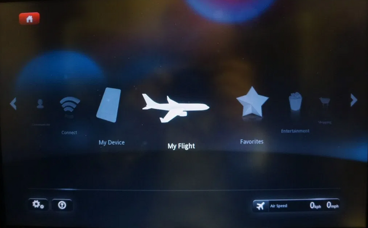
I believe a flatter information hierarchy would be more suitable as it allows users to perform an action with fewer steps. So, users should be able to see available options and select whichever they want directly in a simple click.
For both the accessibility and browsing efficiency, I think larger item images and a brief description about each of them would be essential. Instead of a pop-up box, full-page view can provide a richer and more engaging experience.
For passengers who need to spend 10+ hours on the plane, flight progress and status are usually what they care about the most. So, I think a global function for checking this info would be very useful and convenient.
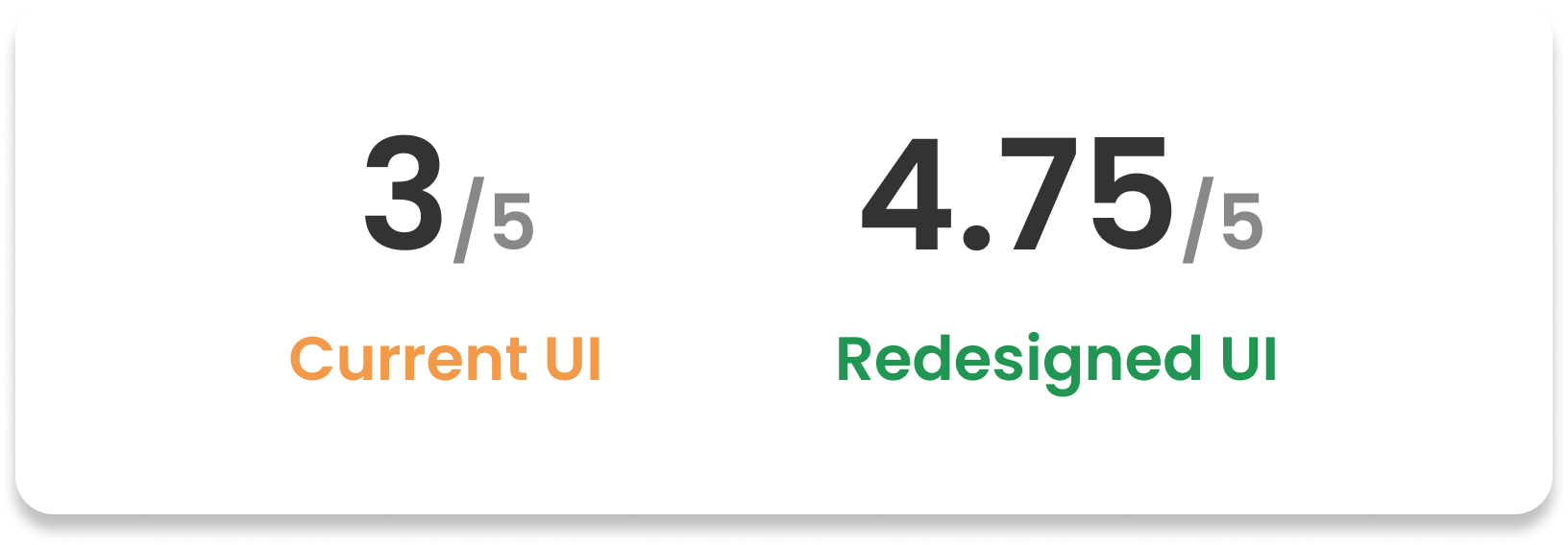
When the prototype was drafted, there were still 4 hours to the destination. So, I invited 4 nearby passengers to do a mini testing. Data I collected include: the number of steps they take for completing a task, self-reported satisfaction, oral comments.
1️⃣ Task 1
What is the name of the 3rd movie in the comedy category?
2️⃣ Task 2
What’s the current flight status (where are we now, how much time has it left, etc.)
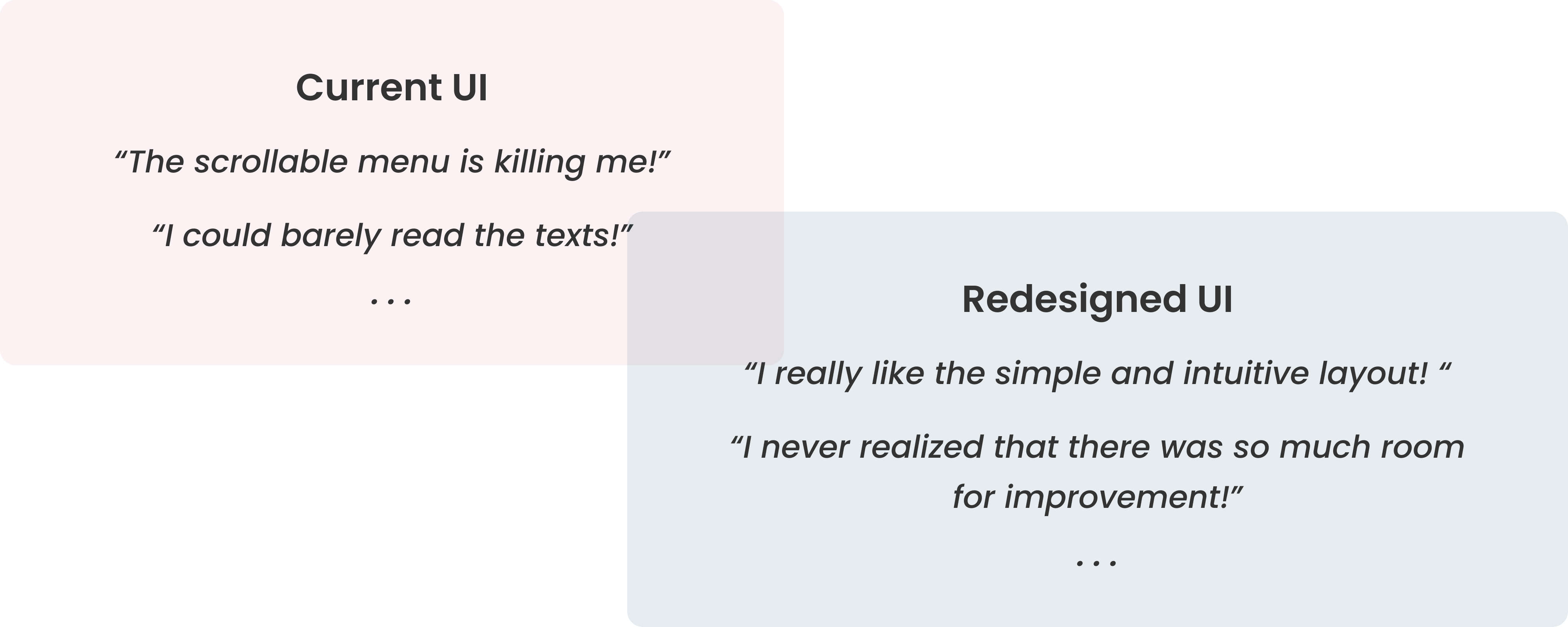

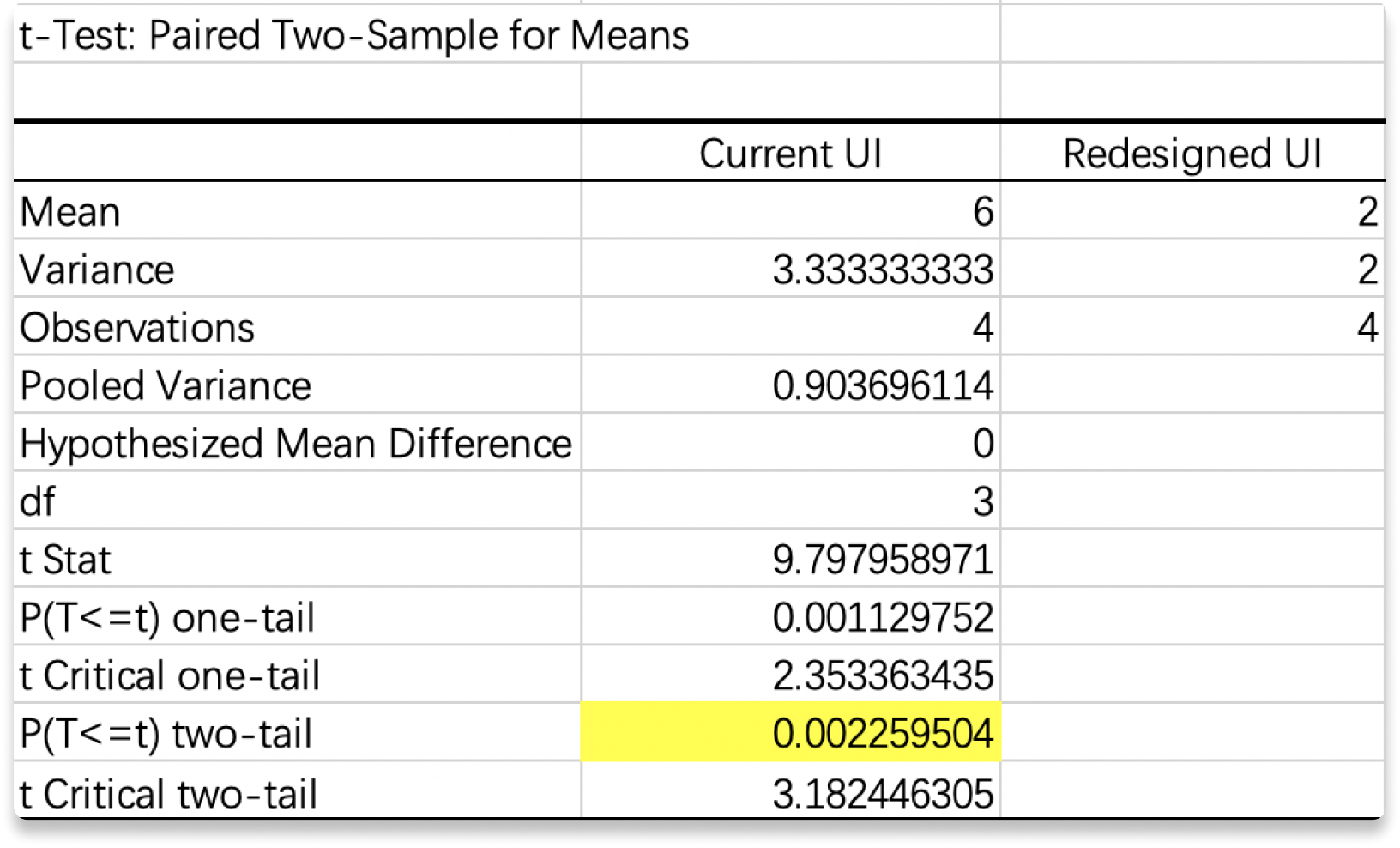
The p values were both obviously less than 0.05, so the null hypothesis should be rejected. In another word, the redesigned UI significantly reduced the steps user need to take for completing these common tasks. In addition, the average satisfaction scores reflected that participants were preferred the new UI.