This project aims to redesign LinkedIn website to help job-seekers better find and apply for jobs. The process includes: learning how people use LinkedIn in the job search process, exploring how LinkedIn can better help job-seekers, and identifying areas for improvement for the future design phase.
As one of the most famous social networks for professionals in the world, LinkedIn allows users to connect with each other for business purposes. Besides, it also provides a wide range of services, such as job listing, professional profile creating, career development, etc.
Since LinkedIn is playing such an important role in bridging job-seekers with potential future employers, I believe there is a great value to make it as well-designed as possible.
How might we redesign LinkedIn to make it better help people find and apply for jobs?
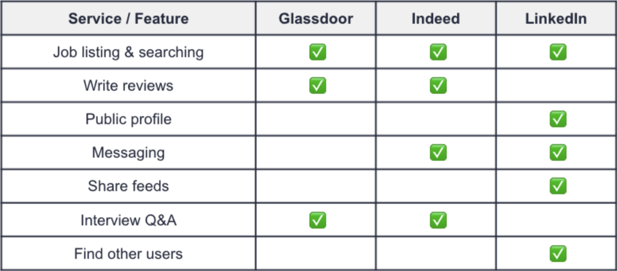
Glassdoor is mainly a review website where current and former employees can comment on a company anonymously.
Indeed.com is a pure job board that aggregates postings from many sources, allowing users to search for specific positions.
LinkedIn is more inclusive than a typical job board. This is LinkedIn's strategic advantages.

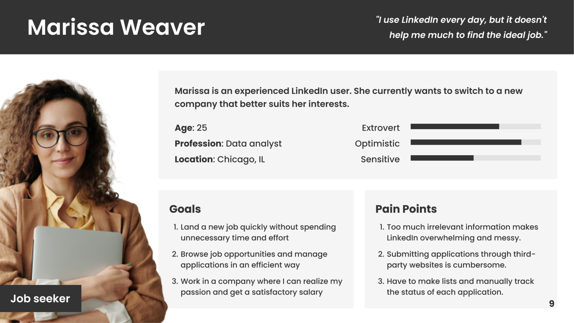
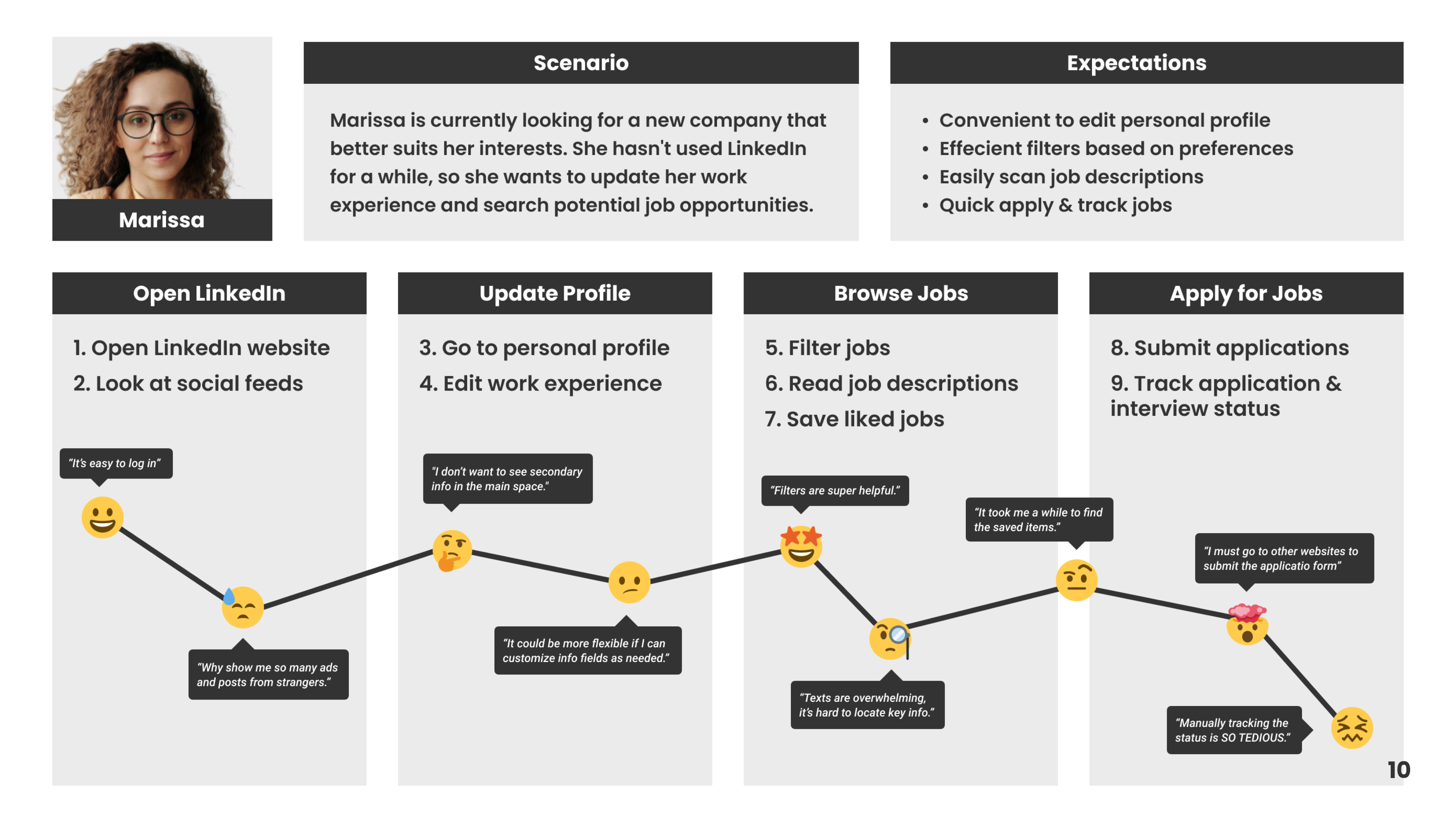
Goals
- Understand how people look for jobs (tools, needs, etc.)
- Understand how people use LinkedIn (pain points, preferences, etc.)
Key Insights
- Profile editing is inconvenience
- Homepage feeds are messy
- Motivated by building connections
- Validity and reliability matter a lot
- Privacy and visibility are desired
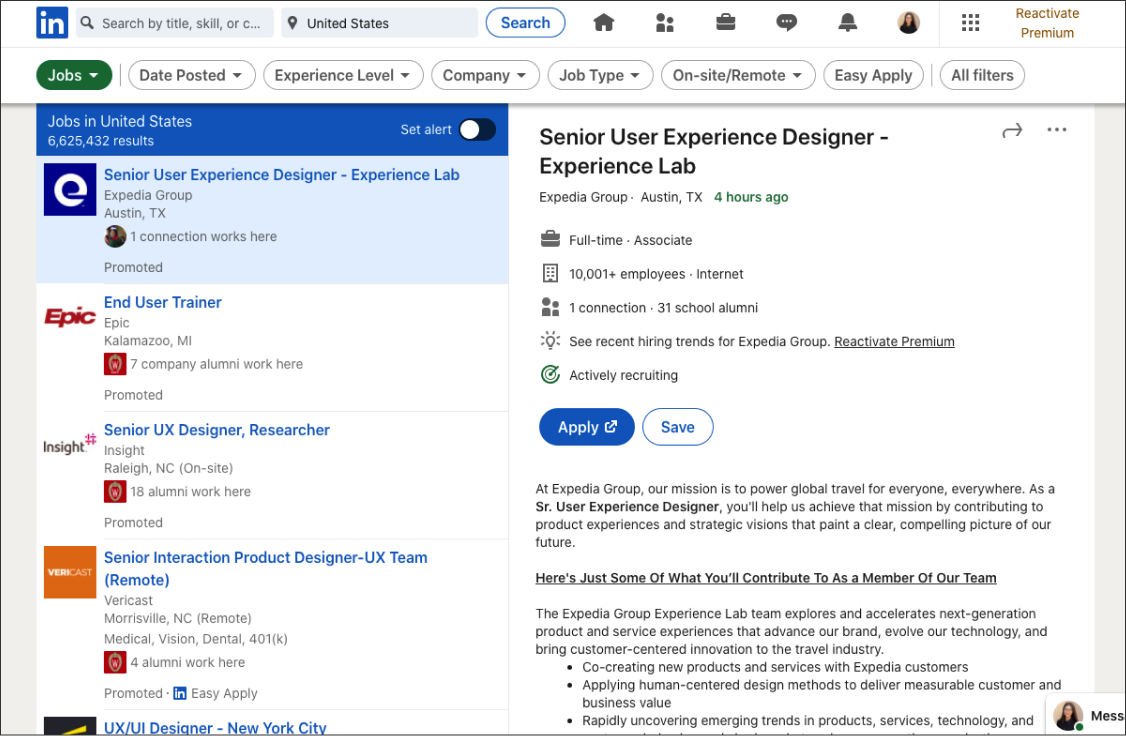
LinkedIn website and companies’ official websites are the most common platforms where people browse jobs.
Job browsing is what people expect to do on LinkedIn, however, the “Jobs” section within LinkedIn is underutilized.
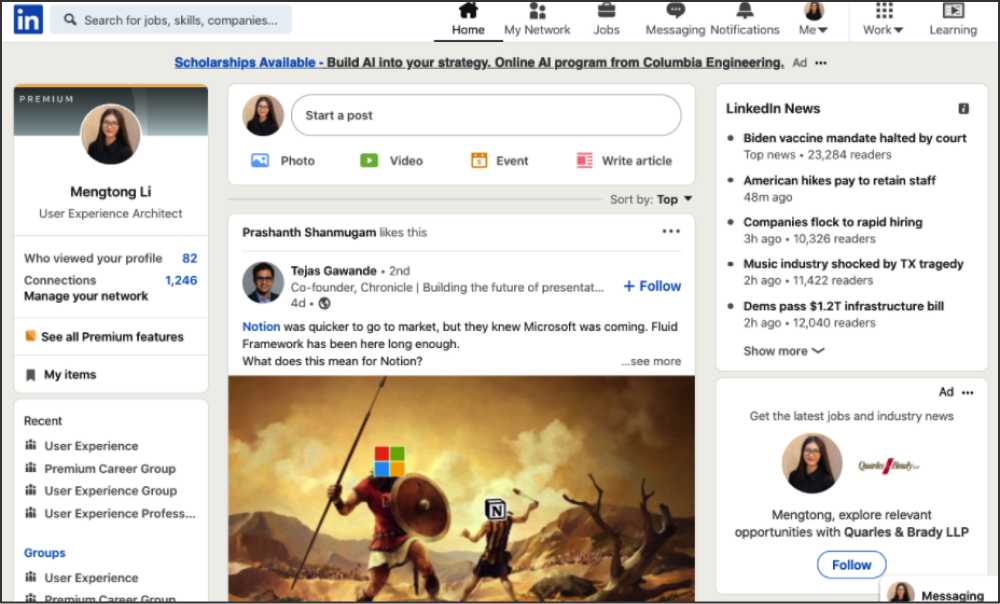
Connecting with others is the most common reason why people use LinkedIn, while few people use the feed feature.
Ads are annoying as people think those are not useful to them. They can't customize profiles as needed, etc.
Alternative texts
Currently, a lot of icons on the LinkedIn website are playing the decorative role, which makes them not accessible enough.
Keyboard navigation
When using the keyboard to navigate this webpage, users must go through all posts on the list, otherwise, they can’t go to the post details. This is so inconvenient for keyboard users, especially when the list is very long.